29. April 2021 By Ralf Schmidt
Data visualisation pitfalls – Part 2: What data visualisations tell us about ourselves
Imagine the following situation: You have just bought a racquet and a ball – for a total of €1.10. If the racquet cost €1 more than the ball, how expensive was the ball? If you intuitively came up with the answer 10 cents, you’re in good company! More than 50% of the participants in a study by Shane Frederick gave this answer, which is however wrong. The correct answer is 5 cents.
So now you’re wondering what this has to do with data visualisation? I will explain this after providing a brief synopsis of the first part of this post.
In the first part of this series, I described common errors in the presentation of data to provide an illustrative introduction to the topic of ‘data’. Data is everywhere – and we have made it a central element of our economy in an effort to make the complexity of the existing data streams tangible to glean new insights from them. But the road to this destination is long and difficult to navigate!
Just look at data collection and how to integrate it: Even the seemingly simple example of a logistics company that wants to optimise the routes of its vehicles automatically can get very complex if you look at the details. Location and traffic data must be retrieved in real time, road information must be enriched with additional information such as topographical data and all data sets must be harmonised. Similar challenges also apply to data validation, preparation or even analysis – and it makes sense to take a closer look at these processes.
The decisive step, however, is ultimately to interpret the information that has been extracted. This is often done via visualisations, which brings us right to the main topic of this article. The focus of this post is on the fact that looking at a representation inevitably results in an interpretation – and this can lead to problems.

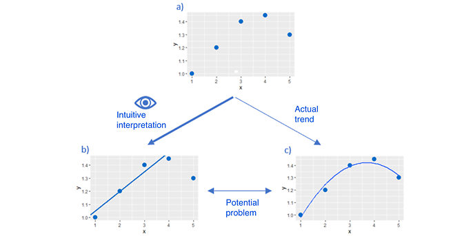
Let me illustrate how the interpretation of a visualisation can become problematic: The visualised data in sub-chart a) inevitably triggers an interpretation of the data in the observer. This is represented by a straight trend line in sub-chart b). However, this interpretation is not necessarily correct and may even contradict the actual trend in sub-chart c), which can have serious consequences.
The slow and the fast system
Explaining why there are problems with tasks like the one posed at the beginning also answers the question of how this relates to data visualisation. Nobel Prize winner Daniel Kahneman has provided a very clear and concise description of the two ‘modes of operation’ of our brain. There is the fast system and the slow, logical thought process. The fast one helps us to react efficiently to the stimuli that constantly affect us and to draw subconscious conclusions from them. However, this system is subject to cognitive distortions that have to be corrected ‘at great expense’ by the slow system. Because data visualisations, too, are immediately interpreted subconsciously by the fast system, it is extremely important to have this connection in mind in order to actively arrive at a logically coherent interpretation of the data ‘with the help’ of the slow yet reflective system whenever necessary. The following examples are meant to further sensitise you and create a heightened awareness about the fuzzy nature of your own chains of inferences.
This awareness can be quite helpful because presentations quite often do not provide enough information to draw any well-founded conclusions. They nonetheless suggest certain conclusions, which is why you need to be highly alert when viewing these.
Confusion times pi squared
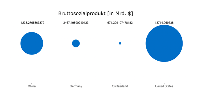
A good example of a visualisation that ‘covertly’ conveys its intended message is the following figure of the gross national product of various countries in 2016 (which was actually used in this way on the official website).

An impressively large circle illustrates the strength of the US economy compared to the other three nations. You can almost hear it shout out: ‘Just ignore the actual figures! Surely you can compare the relative sizes of the various circles.’
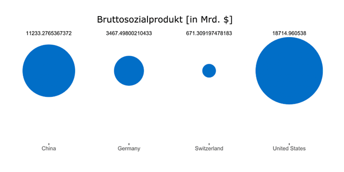
Yes, I can! Yet, unfortunately, I cannot intuit at a glance how the different circles have been scaled. In this case, the radius of each circle was scaled according to economic performance. This is an important detail, as is illustrated in the following figure. If you take the same figures but represent the value based on the area of the circle rather that its radius, you get a very different picture.

Now the sizes of the circles representing the countries’ performance are much closer together, making the difference between them seem smaller as a result. Of course, there is nothing inherently wrong with using different properties for scaling – such as radius or area. But this example serves well to illustrate how easily our initial impression is shaped by the presentation rather than by the actual figures. Our fast system is at work here, trying to help us out as best as it can.
When assuming the purist’s point of view, who is primarily concerned with data being presented in a comprehensible and clear manner, the following justified question arises: Why use circles to present this data? As already demonstrated in the previous part of the blog, we do not excel at interpreting circles – neither when it comes to estimating angles, nor when the area is used to compare values. As so often, the answer is: ‘Google...’ no, ‘a bar chart is your friend’.
#showyourdata
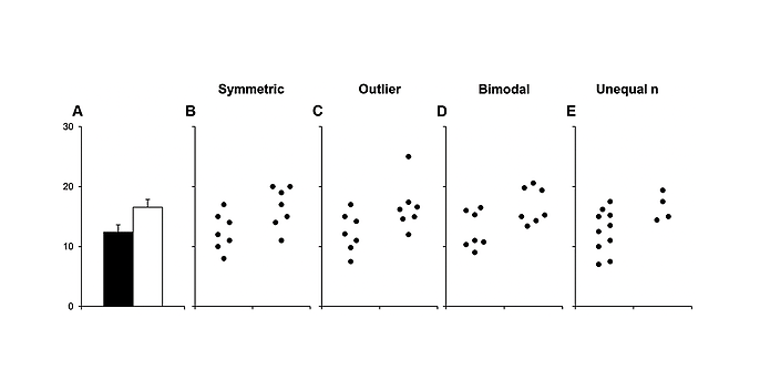
Bar charts, too, have their limitations. This holds true, in particular, if they do not represent pure values, but rather measures – such as median or mean – that include error bars. In this case, each bar represents the underlying distribution of data points, which can be problematic. The following figure from a scientific article illustrates this problem:

The height of the two bars in sub-chart A shows the mean value of the respective distribution. Sections B to E, however, make it very clear that these mean values (and also the associated error bars) can be generated by a wide range of different data clouds. The individual data points can B) be distributed symmetrically around the mean, C) contain outliers that strongly influence the mean, D) occur bimodally (or, of course, multi-modally) in delimited value ranges or E) vary strongly in number between the comparison distributions.
All these aspects play a key role in interpreting the data, but the choice of representation using bars makes them invisible. To the observer, who only has partial picture A available, the underlying truth about the distributions remains hidden. This shifts the focus to the information that both mean values differ significantly.
You should therefore always look at all data points if possible! This allows you to draw your own conclusions before any bars can set your ‘interpretation engine’ in motion.
Conclusion
Good representations are not a matter of course and should therefore not be taken for granted. Whether by conscious design or accidentally, visualisations can influence the way the depicted data is interpreted – and this can have far-reaching consequences. Many viewers are not aware of this ‘responsibility of representations’, which is why they passively consume the information given rather than consciously evaluate it. But given the central role that data plays in our society, we should take the time to fire up our slow system when interpreting it.
Of course, data visualisation is only one aspect of their interpretation. And the path the examples have taken you leads straight into the complex and cumbersome realm of statistics. If you want to pursue this path further, you can use Simpson’s paradox to discover astonishing results in simple aggregations or let Tyler Vigen impressively show you that margarine consumption can explain the divorce rate – if you are willing to equate correlation with causality. As you can see, the end of this post marks only the beginning of our journey towards developing a better understanding of data interpretation. But if you manage to stay vigilant, you have already mastered the most important step.
And you can also put this vigilance to good use elsewhere. In my next post, I will address the problem of modern AI approaches that require so much input data that it becomes impossible to curate it in a structured way. As a result, it is not always clear what the algorithm is actually being trained to do.

